Main menu

Attensi Visual Identity

Attensi delivers AI powered, gamified and virtual training to some of the worlds biggest brands, helping them unleash their people’s potential at scale.
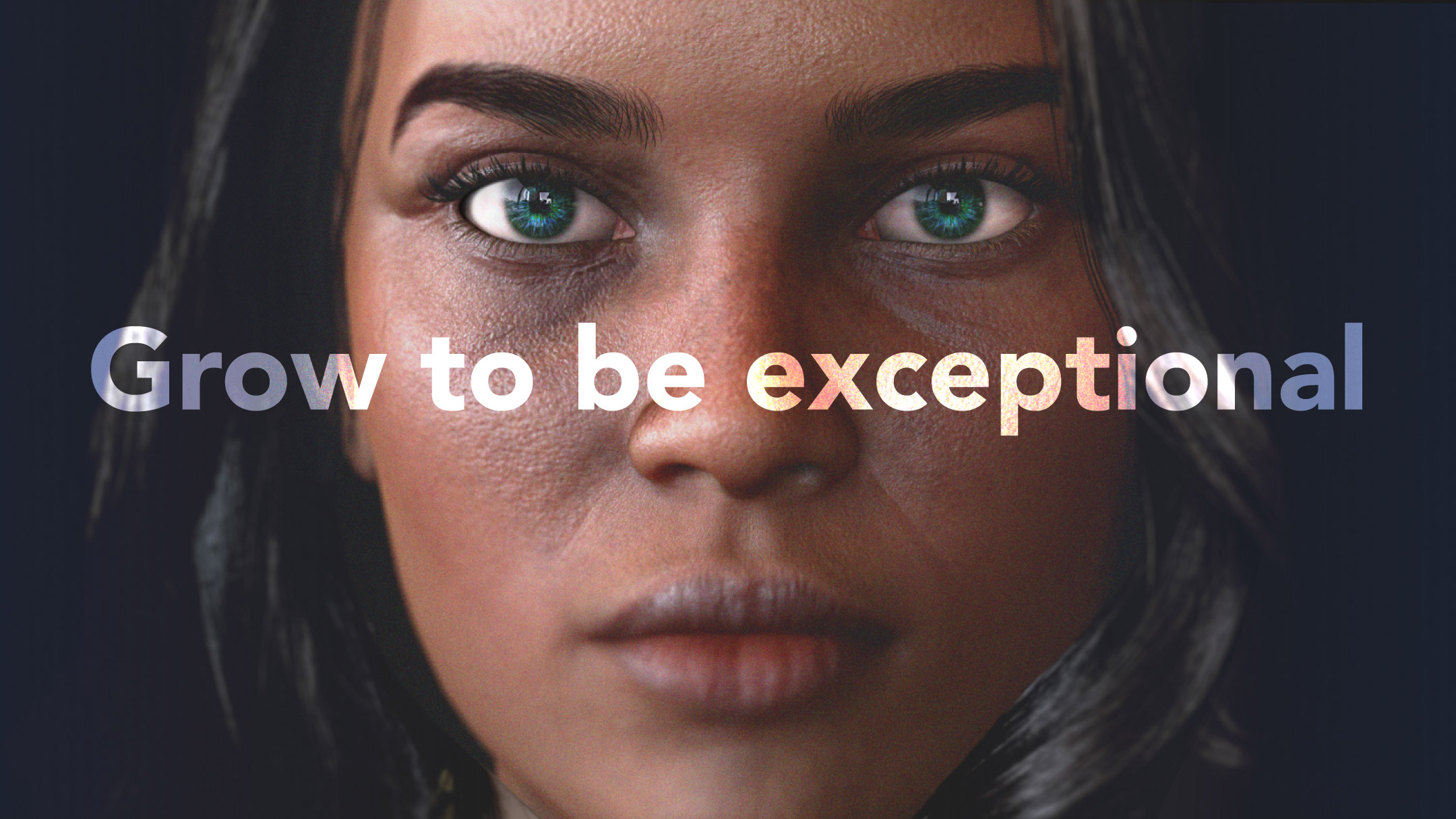
A 3D generated lady, with a determined and bold expression looks directly at the viewer. Over the image is the tagline, “Grow to be exceptional”. The colour of her eyes is on the hue of emerald green and dark sea blue.

Overview

Founded with a little Viking spirit in Norway, Attensi is a global leader in Gamified Training. Using a combination of technology, psychology and gamification, Attensi helps brands like Yo!, KPMG, KAO and Starbucks level up their people through realistic roleplays, quizzes, simulated dialogues and 3D immersive scenarios.

Visual springboard

Following on from a strategic piece of work with Wolf Olins, the Attensi team created the broad strokes of the new brand aesthetic, providing a solid foundation for visual exploration and collaborative development of the visual language.
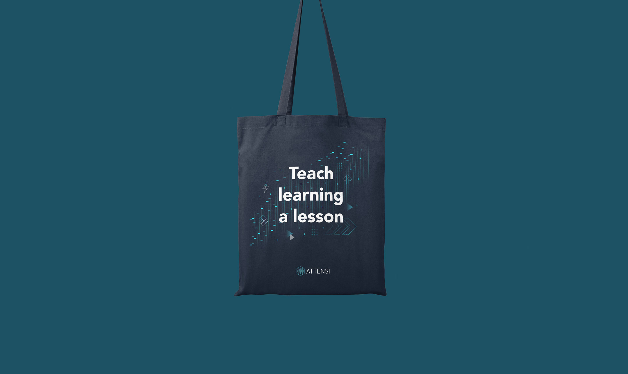
The image displays a dark tote bag against a teal blue background. On the tote bag, there is white and bright blue text that reads "Teach learning a lesson" alongside abstract digital designs, including geometric shapes and circuit-like patterns. The company logo "ATTENSI" is also visible at the bottom of the design. The overall style is modern and tech-oriented.

Impactful, Thoughtful, Playful.

The visual identity is built around 3 key brand characteristics as identified by Wolf Olins; Impactful, Thoughtful and Playful.

With the lead characteristic being ‘Impact’ we created a series of ‘Impact’ icons to display real world success stats — and demonstrate their unrivalled gamified training expertise.
A grid of ten icons with accompanying labels, designed to represent various concepts. The icons include an upward arrow for "Increase", a downward arrow for "Reduction", a lightning bolt for "Impact", a circular chart for "Percentage Donut", a vertical bar for "Percentage Bar", two circular arrows for "Repetitions", a heart for "Love", a star for "Reward", two connecting puzzle pieces for "Knowledge Gap Closure", and a human silhouette with surrounding waves for "Immersive". Each icon is styled in a minimalist, neon green against a dark background.
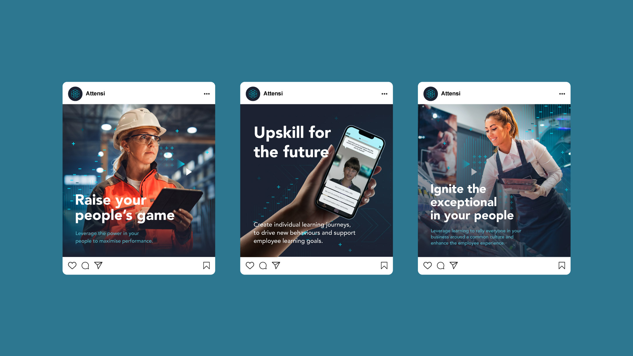
A series of three Instagram posts by Attensi, each advocating different facets of employee development. The first post illustrates a woman in industrial gear using a tablet, captioned "Raise your people's game", underscoring the enhancement of performance. The second post shows a hand holding a smartphone displaying an e-learning application, titled "Upskill for the future", focusing on personalised learning journeys. The third picture captures a cheerful woman in a café setting interacting with a tablet, with "Ignite the exceptional in your people" as the heading, highlighting the significance of bolstering company culture and employee experience through learning. Each post merges vivid imagery with inspiring text, consistent with a contemporary and professional theme.
A 5x5 grid of minimalist icons on a dark background, each symbolising different concepts or tools. They include a smile face, a sad smiley face, a chess knight, a user, a graph with increasing scale, a lock, a target, a magnet and so no all signifying gaming and business icons.
A black tee that says “Ready Set Grow” , and flaunting Attensi’s logo on top of it. The background is solid cyan.
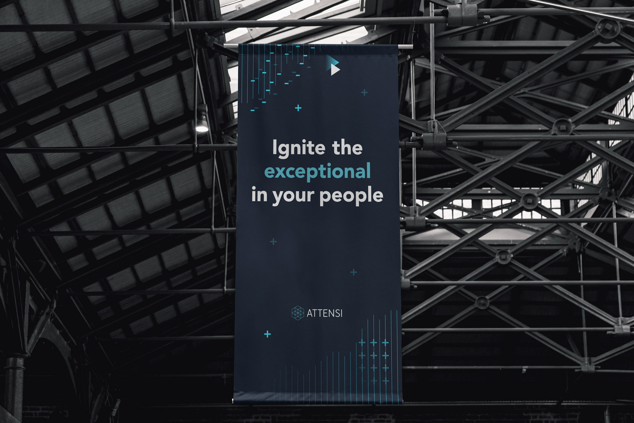
vertical banner hanging in an industrial setting, with "Ignite the exceptional in your people" in large letters, alongside blue digital graphic and the Attensi logo.
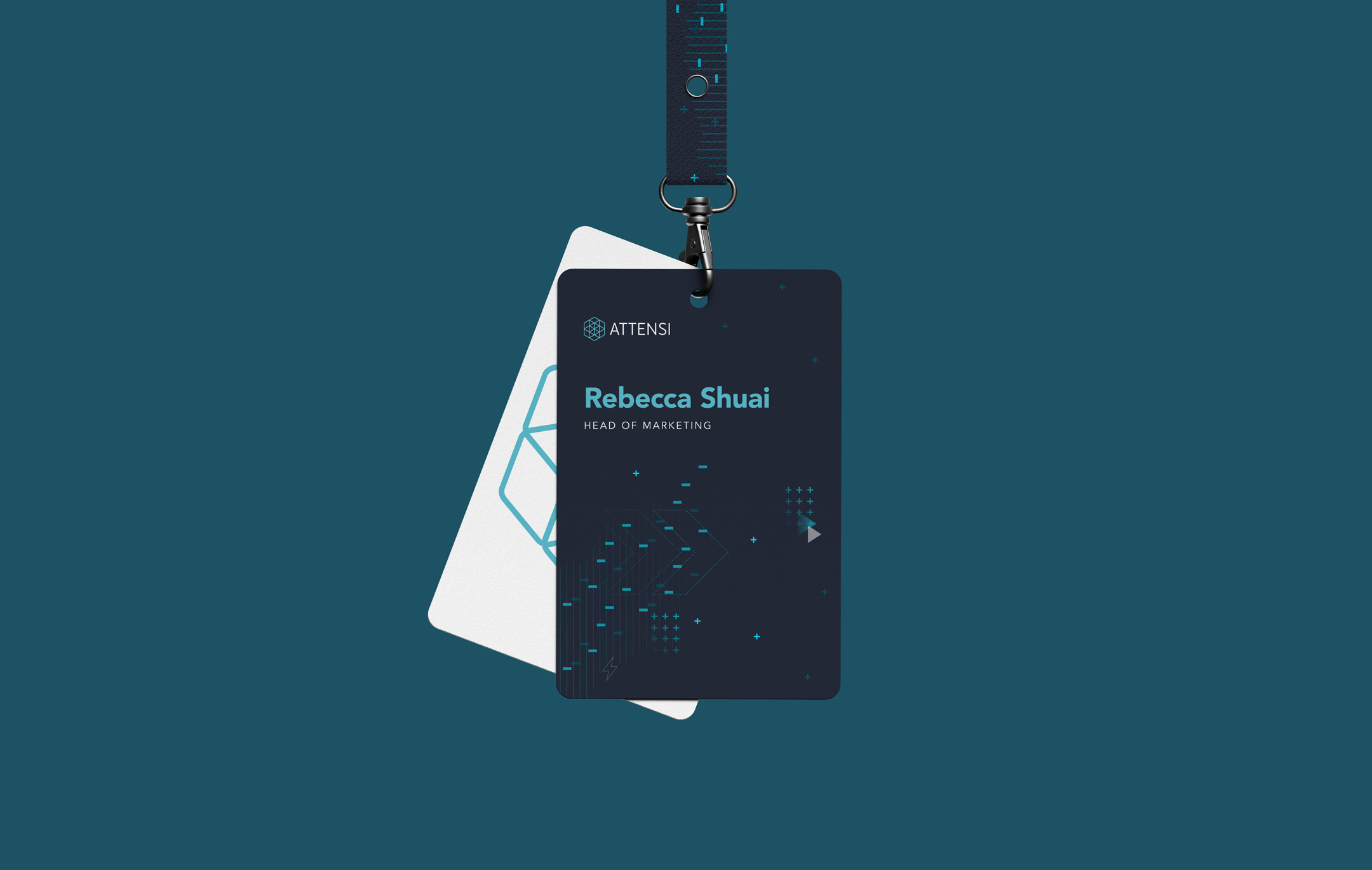
A professional Attensi ID lanyard and card with the details of the Head of Marketing on the front. Modern, digital brand graphics are displayed in blue.

The visual system

The colour palette contextualises the scientific, ‘thoughtful’ approach to gamified training, Meanwhile, various elements and figures engaging with the products convey a playful tone. These elements also function as a means to present the clever messaging and wordplay crafted by Wolf Ollins.

The system included a set of over 90 brand icons which are used extensively over the website. The decision was made internally to retain the long standing brand typeface, Avenir due to it’s approachable, clean, human aesthetic.
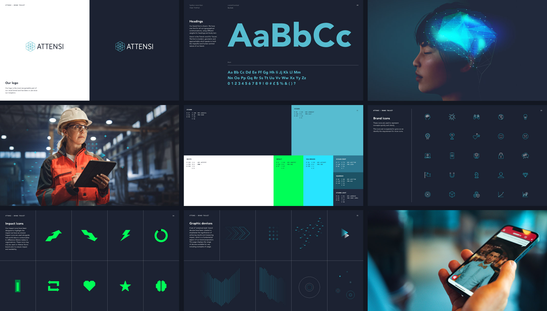
All the visuals containing the fonts, impact icons, the Instagram posts cards, in addition with a side angle view of a girl’s face, short hair with some code functioning happening inside the brain section, and a hand holding a mobile phone appears on the screen. And the picture displays all the relevant information and visuals related to gaming that have been featured on the website until now.